
Anyway, I did manage to get the bare bones of my crafting area all set up. I moved myself in and managed to work on a layout today. It's part of a new project, a 12x12 book of my sheltie, Kosmo. I need to get some more pics developed but I worked with what I had today. Thankfully there were two decent pics of him floating in my photo box.

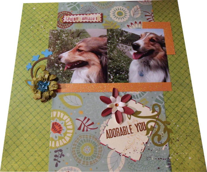
In this LO, that I got from PageMaps.com, I used die cuts from a Cricut cartridge. Sorry, but I am not sure which cartridge it is since I don't own it. The background paper is from a cardstock pack from Wal-Mart. The whimsical blue background is a single piece of pattern paper from JoAnn (I think). The background for the Just Smile and the flower closer to the bottom are made of two pattern papers from My Minds Eye which I stamped. The note card, stamped with Adorable You and a pale copper flower (which doesn't show up well on this pic) is just plain cream cardstock. The orange sparkle cardstock is, I believe, from JoAnns as well and was a single sheet buy.
I did add some paint splatter near the top left and bottom right corners in cream and purple. The Just Smile accent is also raised up to add a bit more dimension to the page. This was a pretty clean layout for me. I usually go for a more grungy or aged look but I really like the way it came out.
OH! Also, I need to come up with a way to take better pictures of my LO's. If anyone has any hints/tips PLEASE let me know.

